目次
Hello, animation!とは
ゲーム感覚でCSSアニメーションを学べるWebサイト。
無料で学べる問題が全32問あり、すべて習得すればCSSアニメーションの基礎が身につきます。
Webサイトを制作するにはCSSアニメーションの知識が必須なので、Hello, animation!で基礎を学んでおくと良いでしょう。
この記事では初心者向けに全32問の解説と解答を記載しています。
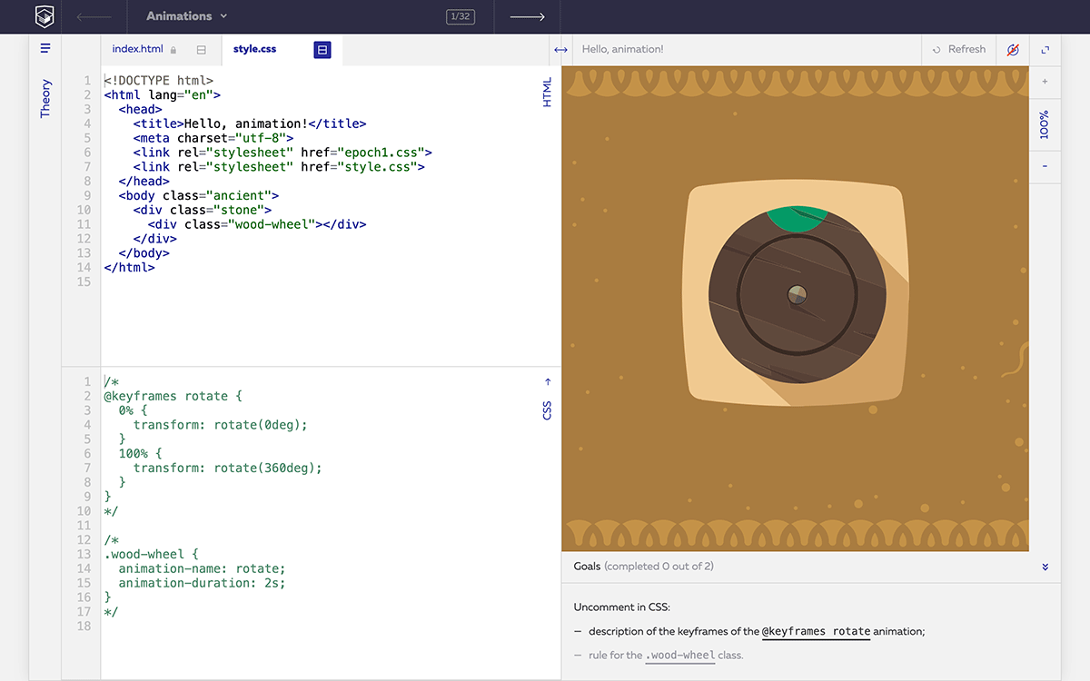
問題1
Uncomment in CSS:

- description of the keyframes of the @keyframes rotate animation;
- rule for the .wood-wheel class.
https://css-animations.io/task/1
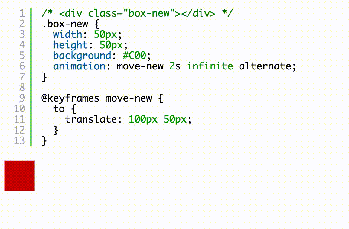
最初の問題はCSSアニメーションがどのように動くかを知るための問題。
CSSアニメーションは要素にanimation-nameプロパティでアニメーションの名前を定義して、@keyframesで動きを指定します。
最初の問題はコメントアウトを削除して以下のようにすれば正解です。
.wood-wheelが2秒で1回転するアニメーションになります。
1回転する際に速さが等速でないのは、CSSアニメーションのタイミング関数(animation-timing-function)のデフォルト値がlinear(等速)ではなくeaseになっているためです。
@keyframes rotate {
  0% {
    transform: rotate(0deg);
  }
  100% {
    transform: rotate(360deg);
  }
}

.wood-wheel {
  animation-name: rotate;
  animation-duration: 2s;
}
問題2
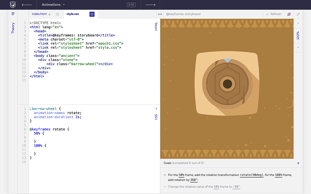
- For the 50% frame add the rotation transformation rotate(90deg) for the 100% frame add rotation by 360°
- Change the rotation value of the 50% frame to -90°
問題のGoalsには2つの指定がある。
https://css-animations.io/task/2
まず50%をrotate(90deg)にして100%をrotate(360deg)にして実行する。
@keyframes rotate {
  50% {
    transform: rotate(90deg);
  }
  100% {
    transform: rotate(360deg);
  }
}
次に50%をrotate(-90deg)にして実行する。
@keyframes rotate {
  50% {
    transform: rotate(-90deg);
  }
  100% {
    transform: rotate(360deg);
  }
}
@keyframesは0%だけでなく50%からでも指定できるのと、rotateにはマイナス値が使えるのを学ぶ問題です。
0%がないと 0% { transform: rotate(0deg); } と解釈されてCSSアニメーションが実行されます。
問題3
Create an at-rule called lift-up containing some keyframes:

- from with a transform: translateY(0px) transformation;
- 50% with a transform: translateY(-250px) transformation;
- 100% with a transform: translateY(-300px) transformation.
https://css-animations.io/task/3
fromとtransform: translateYでCSSアニメーションを実装する問題。
fromは0%、toは100%の代わりとして使用できます。
@keyframes lift-up {
  from {
     transform: translateY(0px)
  }
  50% {
    transform: translateY(-250px)
  }
  100% {
    transform: translateY(-300px)
  }
}
上記は0pxを0、100%をtoにしても同じ動きになります。
問題4
- Change the value of frame 50% to 50%, 80%
- Change the motion transformation in frame 50%, 80% to transform: translateY(-50px)
https://css-animations.io/task/4
50%を50%, 80%にしてtranslateY(-50px)を指定する問題。
animation-durationが3秒なので@keyframesの10%は0.3秒。
50%, 80%がtranslateY(-50px)ということは30%の0.9秒はtranslateY(-50px)で停止となる。
.platform {
  animation-name: lift-up;
  animation-duration: 3s;
}

@keyframes lift-up {
  0% {
    transform: translateY(0px);
  }
  50%, 80% {
    transform: translateY(-50px);
  }
  100% {
    transform: translateY(-300px);
  }
}
問題5
- Create an animation called rotate with one keyframe 50% containing a rotation transformation transform: rotate(360deg)
- Assign the animation-name: rotate and animation-duration: 3s properties to the .stone-wheel block.
https://css-animations.io/task/5
1つの要素に対して、複数のアニメーションを同時に割り当てた問題。
問題5から1からCSSを書かなくてはならないので難易度が上がっている。
問題文の通りにkeyframe 50%にtransform: rotate(360deg)を指定して、.stone-wheelにanimation-name: rotateとanimation-duration: 3sを指定するだけ。
問題4までができていれば簡単な問題だが、初心者だと「@keyframes」ではなく「@keyframe」と「s」を付け忘れることが多いので注意が必要です。
@keyframes rotate {
  50% {
    transform: rotate(360deg)
  }
}

.stone-wheel {
  animation-name: rotate;
  animation-duration: 3s;
}
問題6
- Create an animation called move and containing the following keyframes:
  1. 50% with a bottom: 0px property;
  2. 100% with a bottom: -50px property.
- Add a second move animation with a duration of 6s to the .stone-wheel block.
https://css-animations.io/task/6
複数のアニメーションをコンマで区切ってプロパティで指定する問題。
問題文に書かれている通り、@keyframes moveを記述したあと、.stone-wheelにカンマで区切って、それぞれ書けば割り当てることができる。
@keyframes rotate {
  50% {
    transform: rotate(360deg);
  }
}

@keyframes move {
  50% {
    bottom: 0px;
  }
  100% {
    bottom: -50px;
  }
}

.stone-wheel {
  animation-name: rotate, move;
  animation-duration: 3s, 6s;
}
問題7
- Create an animation move-clouds containing a frame to with a translateX(-1000px) transformation,
- a move-sun animation containing a to frame with a translate(350px, -400px) transformation,
- and a move-ship animation containing a to frame with a translateX(1000px) tranformation.
https://css-animations.io/task/7
translateXやtranslateで要素を移動させる問題。
@keyframesで指定してtransformで動きを指定する問題。
コード内に.comet (move-comet)が含まれているが、問題とは関係ないので消しても問題ない。
.ship {
  animation-name: move-ship;
  animation-duration: 40s;
}

.clouds {
  animation-name: move-clouds;
  animation-duration: 40s;
}

.sun-small {
  animation-name: move-sun;
  animation-duration: 10s;
}

@keyframes move-clouds {
  to {
    transform: translateX(-1000px);
  }
}

@keyframes move-ship {
  to {
    transform: translateX(1000px);
  }
}
問題8
- Assign a rotate animation with a duration of 2s to the arrow .arrow
- then set 2 for the number of animation playback cycles,
- then change the play count to infinite.
https://css-animations.io/task/8
animation-iteration-countを使用する問題。
animation-nameとanimation-durationを追加したあと、animation-iteration-countを再生回数分追加する。
animation-iteration-countを2にしたあとinfiniteを指定すれば正解。
.arrow {
  animation-name: rotate;
  animation-duration: 2s;
  /* animation-iteration-count: 2; */
  animation-iteration-count: infinite;
}
問題9
- Assign a clockwise animation to the large cogwheel .gear-big with a duration of 2s
- then assign an counterclockwise animation to the small cogwheel .gear-small with a duration of 2s
- then reverse the rotation of both cogwheels.
https://css-animations.io/task/9
animation-directionを使用する問題。
アニメーション再生の向きをreverseで逆方向、alternateで前後反転に設定できる。
下記のようにそれぞれの要素に animation-direction: reverse; を付ければ正解です。
.gear-big {
  animation-name: clockwise;
  animation-duration: 2s;
  animation-direction: reverse;
}

.gear-small {
  animation-name: counterclockwise;
  animation-duration: 2s;
  animation-direction: reverse;
}
問題10
- Set the playback count for both cogwheels to 2
- then set the alternating direction of playback,
- then change the direction to reverse alternating.
https://css-animations.io/task/10
問題9と同じくanimation-directionを使用する問題。
問題文の「change the direction to reverse alternating」が animation-direction: alternate-reverse; のことだとわからないと解けない問題。
.gear-big {
  animation-name: clockwise;
  animation-duration: 2s;
  animation-iteration-count: 2;
  animation-direction: alternate-reverse;
}

.gear-small {
  animation-name: counterclockwise;
  animation-duration: 2s;
  animation-iteration-count: 2;
  animation-direction: alternate-reverse;
}
問題11
- Create a rotate animation containing one to frame with a 360deg rotation transformation,
- then assign this animation to the .arrow-small arrow for the duration of 1s
https://css-animations.io/task/11
animation-durationを使用する問題。
.arrow-smallを1回のアニメーション周期が完了するまでの所要時間を1秒に設定するので、正解は以下の通り。
@keyframes rotate {
  to {
    transform: rotate(360deg);
  }
}

.arrow-small {
  animation-name: rotate;
  animation-duration: 1s;
}
問題12
- Create an animation ding containing the following keyframes:
  33% with a translateX(-15px) transformation;
  66% with a translateX(15px) transformation.
- Then assign this animation to the bell .bell with a duration of 1s
https://css-animations.io/task/12
animation-durationを別々の要素に適用して動かす問題。
この問題でanimation-delayは使わない。
@keyframes rotate {
  to {
    transform: rotate(360deg);
  }
}

@keyframes ding {
  33% {
    transform: translateX(-15px);
  }
  66% {
    transform: translateX(15px);
  }
}

.arrow-small {
  animation-name: rotate;
  animation-duration: 1s;
}

.bell {
  animation-name: ding;
  animation-duration: 1s;
}
問題13
Set the following animation parameters to the bell .bell:
- start delay of 1s
- duration of 100ms
- animation cycles: 10
https://css-animations.io/task/13
animation-delayを使用する問題。
問題文の通りに.bellにプロパティと値を指定する。
.bell {
  animation-name: ding;
  animation-duration: 100ms;
  animation-delay: 1s;
  animation-iteration-count: 10;
}
問題14
- Assign a move-birds animation with a duration of 30s to the birds .birds
- then assign a move-wheel animation with a duration of 10s and an infinite   number of replays to the mill .wind-mill
- then assign a move-aerostat animation with a duration of 20s and a playback delay of 5s to the balloon .aerostat
https://css-animations.io/task/14
問題文に書かれている通りに各要素にプロパティを追加するだけの問題。
以下のように追記されれば正解です。
.birds {
  animation-name: move-birds;
  animation-duration: 30s;
}

.wind-mill {
  animation-name: move-wheel;
  animation-duration: 10s;
  animation-iteration-count: infinite;
}

.aerostat {
  animation-name: move-aerostat;
  animation-duration: 20s;
  animation-delay: 5s;
}
問題15
- Assign the reaction animation to both .reagent chemicals with a duration of 3s and a playback delay of 2s
- and then make the experimental chemical .experimental-reagent save its state after animation.
https://css-animations.io/task/15
animation-fill-modeを使用した問題。
.reagentに各プロパティを指定したあと、.experimental-reagentのほうだけ animation-fill-mode: forwards; を指定してアニメーションの最後の状態を維持する。
.reagent {
  animation-name: reaction;
  animation-duration: 3s;
  animation-delay: 2s;
}

.experimental-reagent {
  animation-fill-mode: forwards;
}
問題16
Set the following parameters to the chemical in the experimental tube .experimental-reagent:
- saving of the final state after animation,
- number of animation cycles 2
- and an alternating animation direction.
https://css-animations.io/task/16
問題15と同様にanimation-fill-modeを使用した問題。
問題文に書かれている通りにプロパティを指定するだけ。
.experimental-reagent {
  animation-fill-mode: forwards;
  animation-iteration-count: 2;
  animation-direction: alternate;
}
問題17
- Assign a power animation with a duration of 2s and a playback delay of 2s to the battery charge .energy-fill
- then make the charge in the experimental battery .mega-energy-fill display its state before the animation starts.
https://css-animations.io/task/17
animation-fill-mode: backwards; を使用した問題。
animation-fill-mode: backwards; はanimation-delayの時間分のアニメーションを保持する。
.energy-fill {
  animation-name: power;
  animation-duration: 2s;
  animation-delay: 2s;
}

.mega-energy-fill {
  animation-fill-mode: backwards;
}
問題18
Set the following parameters to the charge of the experimental battery .mega-energy-fill:
- number of animation cycles 2
- and an alternating animation direction.
https://css-animations.io/task/18
.mega-energy-fill に問題文のプロパティを追加するだけの問題。
.mega-energy-fill {
  animation-fill-mode: backwards;
  animation-iteration-count: 2;
  animation-direction: alternate;
}
問題19
Set the following properties to the charge of the experimental .mega-energy-fill battery:
- keep the pre- and post-animation states
- number of animation cycles: 2
- and then an alternating direction of animation.
https://css-animations.io/task/19
animation-fill-mode: both; を使用する問題。
bothはforwardsとbackwardsの両方の特性をあわせ持つ。
.mega-energy-fill {
  animation-fill-mode: both;
  animation-iteration-count: 2;
  animation-direction: alternate;
}
問題20
- Assign a move-plane animation to the plane .plane with a duration of 10s
- then assign the move-antenna animation to the satellite dish .antenna with a duration of 2s a playback delay of 2s and keep the animation state after playback.
https://css-animations.io/task/20
.plane {
  animation-name: move-plane;
  animation-duration: 10s;
}

.antenna {
  animation-name: move-antenna;
  animation-duration: 2s;
  animation-delay: 2s;
  animation-fill-mode: forwards;
}
問題21
- Assign a the move-car animation to the car .car: duration 4s start delay 5s keep the post-animation state.
- Assign the show-fog animation to the smoke clouds .fog-1 and .fog-2 with the following parameters: duration 1s2 cycles, alternating direction.
- .fog-1 should have a playback delay of 9s.fog-2 — 10s
https://css-animations.io/task/21
.plane {
  animation-name: move-plane;
  animation-duration: 10s;
}

.antenna {
  animation-name: move-antenna;
  animation-duration: 2s;
  animation-delay: 2s;
  animation-fill-mode: forwards;
}

.car {
  animation-name: move-car;
  animation-duration: 4s;
  animation-delay: 5s;
  animation-fill-mode: forwards;
}

.fog-1,
.fog-2 {
  animation-name: show-fog;
  animation-duration: 1s;
  animation-iteration-count: 2;
  animation-direction: alternate;
}

.fog-1 {
  animation-delay: 9s;
}

.fog-2 {
  animation-delay: 10s;
}
問題22
- Create a move animation with a keyframe to containing a left: 400px property,
- then assign this animation to the robots .robot.
- Create a .robot-paused rule that will pause the animation.
The robot-paused class is activated when the robots are clicked on. Try clicking on them while they are moving!
https://css-animations.io/task/22
animation-play-state: paused; でCSSアニメーションの動きを停止させる問題。
.robot-pausedがindex.html内にないが、ロボット画像をクリックすると追加されます。
※ クリックするとデベロッパーツールで class="robot warrior robot-paused" が確認できる。
@keyframes move {
  to {
    left: 400px;
  }
}

.robot {
  animation-name: move;
  animation-duration: 5s;
  animation-iteration-count: 2;
  animation-direction: alternate;
}

.robot-paused {
  animation-play-state: paused;
}
問題23
Set the linear animation type to both .robot robots.
https://css-animations.io/task/23
animation-timing-function: linear; でアニメーションを等速にする問題。
animation-timing-functionのデフォルトはeaseなのでlinearを適用しないと等速にならないので注意。
.robot {
  animation-name: move;
  animation-duration: 3s;
  animation-fill-mode: forwards;
  animation-timing-function: linear;
}
問題24
Successively assign the following animation forms to the robot .constructor:
- ease-in
- ease-out
- ease-in-out
https://css-animations.io/task/24
.constructorにanimation-timing-functionでease-in, ease-out, ease-in-outを適用させる問題。
animation-timing-functionはこれらに加えてlinearがよく使用される。
.constructor {
  animation-name: move;
  animation-timing-function: ease-in-out;
}
問題25
- Assign an animation form cubic-bezier(0, 0, 1, 1) to the robots .robot
- then replace it with cubic-bezier(0.785, 0.135, 0.15, 0.86) just for .constructor,
- then replace it with cubic-bezier(0.175, 0.885, 0.32, 1)
https://css-animations.io/task/25
cubic-bezierに関する問題。
cubic-bezierは覚えても実際の仕事で使用されることはあまりない。
.robot {
  animation-name: move;
  animation-duration: 3s;
  animation-fill-mode: forwards;
  animation-timing-function: cubic-bezier(0, 0, 1, 1);
}

.constructor {
  animation-timing-function: cubic-bezier(0.175, 0.885, 0.32, 1);
}
問題26
- Assign a steps(5, start) animation form to the robot .constructor
- then change it to steps(5, end)
https://css-animations.io/task/26
animation-timing-functionでstepsを使用した問題。
steps(5, end)はsteps(5)のようにjumptermを省略して使用されることが多い。
.constructor {
  /* animation-timing-function: steps(5, start); */
  animation-timing-function: steps(5, end);
}
問題27
- Create an animation fire containing a frame to with an opacity: 1 property,
- then assign this animation to the fuel .fuel with a duration of 1s and have it keep the post-animation state.
https://css-animations.io/task/27
@keyframes fireを追加して.fuelを点火するアニメーションを作成する問題。
直接的なヒントが少ないがこれまでの内容を習得できていれば簡単に解ける。
@keyframes fire {
  to {
    opacity: 1;
  }
}

.fuel {
  animation-name: fire;
  animation-duration: 1s;
  animation-fill-mode: forwards;
}
問題28
- Create an animation fly containing a frame to with a transform: rotate(40deg) translate(0px, -500px) transformation,
- then assign this animation to the rocket .rocket duration 1s animation delay 1sease-in type, keep the state after animation.
https://css-animations.io/task/28
問題27のロケットを右上に移動させる問題。
使用するプロパティが多いので、基礎ができていないと解けない問題。
.fuel {
  animation-name: fire;
  animation-duration: 1s;
  animation-fill-mode: forwards;
}

.rocket {
  animation-name: fly;
  animation-duration: 1s;
  animation-delay: 1s;
  animation-timing-function: ease-in;
  animation-fill-mode: forwards;
}

@keyframes fire {
  to {
    opacity: 1;
  }
}

@keyframes fly {
  to {
    transform: rotate(40deg) translate(0px, -500px);
  }
}
問題29
- Create an animation fly containing a frame to with a transform: translate(240px, 260px) rotate(-45deg) transformation,
- then assign this animation to the rocket .rocket1.5s in duration, ease-out type, keep the state after animation.
https://css-animations.io/task/29
ロケットを指定通りに動かす問題。
問題文の通りだとロケットっぽい動きにならないが、下記が正解となる。
.rocket {
  animation-name: fly;
  animation-duration: 1.5s;
  animation-timing-function: ease-out;
  animation-fill-mode: forwards;
}

@keyframes fly {
  to {
    transform: translate(240px, 260px) rotate(-45deg);
  }
}
問題30
- Create an animation fire containing a frame to with a property opacity: 0
- Then assign this animation to our fuel .fuel duration 1s start delay 1s keep the state after animation.
https://css-animations.io/task/30
.fuelにアニメーションを追加する問題。
.rocket {
  animation-name: fly;
  animation-duration: 1.5s;
  animation-timing-function: ease-out;
  animation-fill-mode: forwards;
}

.fuel {
  animation-name: fire;
  animation-duration: 1s;
  animation-delay: 1s;
  animation-fill-mode: forwards;
}

@keyframes fly {
  to {
    transform: translate(240px, 260px) rotate(-45deg);
  }
}

@keyframes fire {
  to {
    opacity: 0;
  }
}
問題31
- Create an animation hoist containing a frame to with a top: -25px property,
- then assign this animation to the flag .flag duration 1s animation delay 2sease-in type, keep the state after animation.
https://css-animations.io/task/31
.flagにアニメーションを追加する問題。
.flag {
  animation-name: hoist;
  animation-duration: 1s;
  animation-delay: 2s;
  animation-timing-function: ease-in;
  animation-fill-mode: forwards;
}

@keyframes hoist {
  to {
    top: -25px;
  }
}
問題32
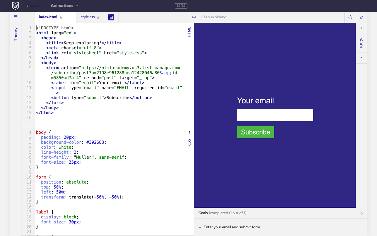
- Enter your email and submit form.
https://css-animations.io/task/32
最後は問題ではなくemailを登録するだけ。
しかし、現在はメールアドレスを入力してSubscribeを押しても404になるので解答不可。
一括指定プロパティについて
すべての問題ではanination関連のプロパティを個別に適用させているが、これらはanimationプロパティを使えば一括指定できるので、仕事で問題のような書き方をしている人は少ない。
.foo {
  animation: slidein 3s linear 1s;
}
animation - CSS: カスケーディングスタイルシート | MDN